Visitors decide very quickly whether they're in the right place. In those first few seconds, your website has to answer three questions: What do you do? Is it for someone like me? What should I do next? Sites that answer all three clearly tend to convert. Sites that make visitors work for it tend not to.
Here's the checklist we use on every service business website we build.
1. A headline that says what you do
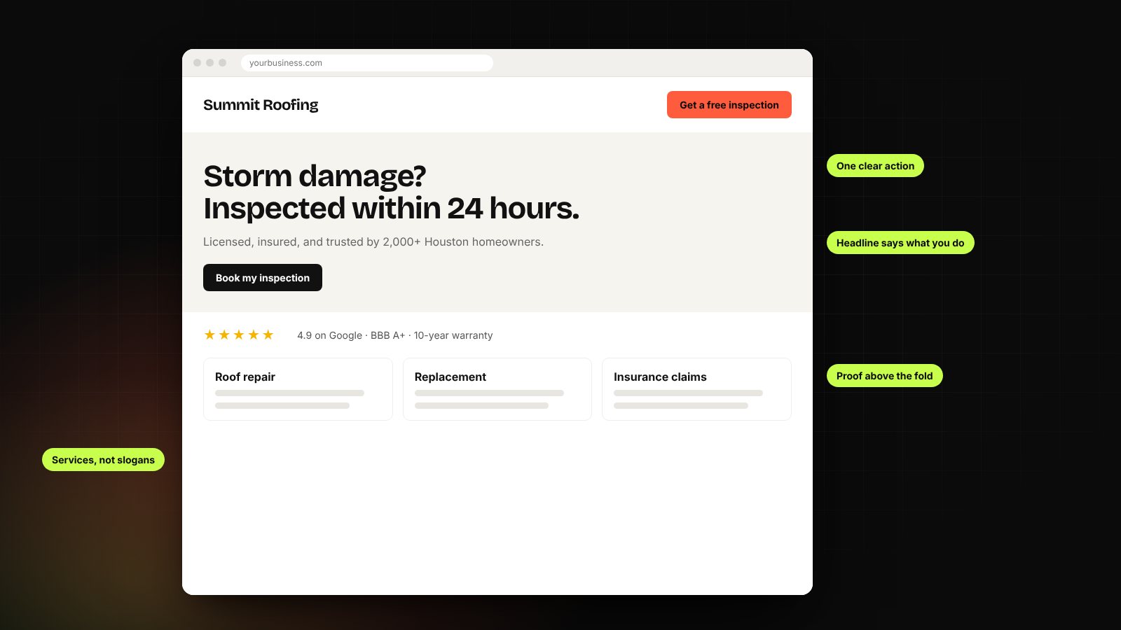
"Excellence in every project" could describe anyone. "Storm damage roof repair in Houston, inspected within 24 hours" tells the right visitor they've found what they need. Be specific about the service, the customer and, for local businesses, the area.
2. One clear primary action
Decide the single most valuable thing a visitor can do: book a consultation, request a quote, schedule an inspection. Make that the main button, use the same wording everywhere, and repeat it at natural decision points down the page.
3. Proof near the top
Reviews, ratings, certifications, recognizable clients, years in business, guarantees. People look for reasons to trust you before they read your story, so put the strongest proof where they'll see it without scrolling far.
4. A page for every service
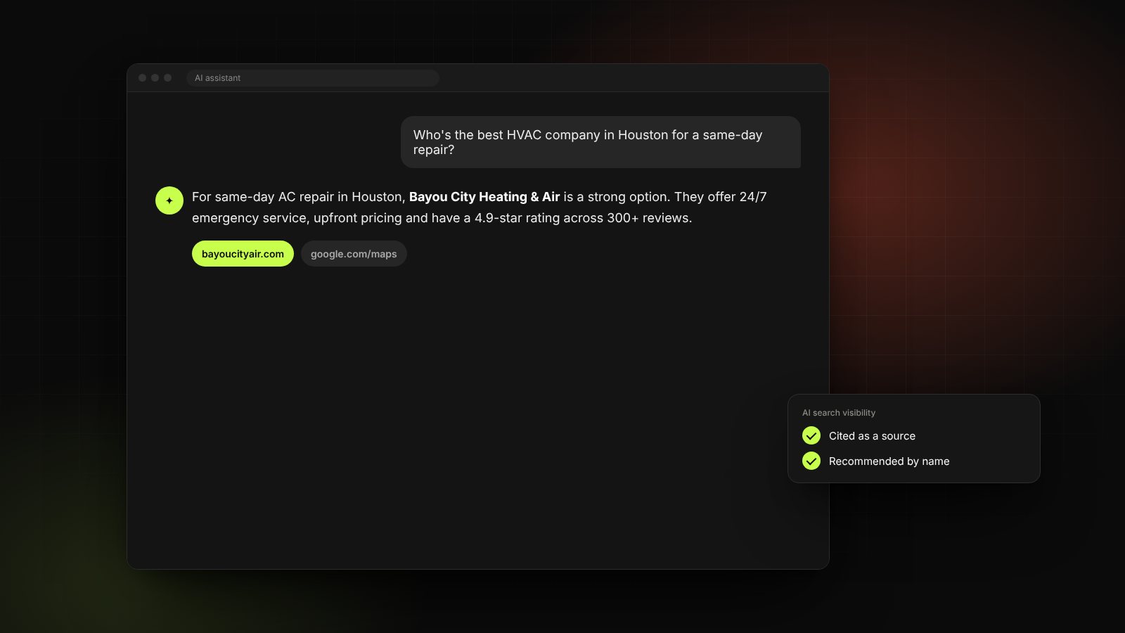
Each service deserves its own page explaining what's included, who it's for, how the process works, typical timelines and common questions. These pages convert better because they speak to a specific need, and they're also what search engines and AI tools use to understand what you offer.
5. Speed and mobile, treated as essentials
Most service business traffic now comes from phones. Pages should load fast on a mobile connection, buttons should be easy to tap, and phone numbers should be one tap away. A slow site loses visitors before they've seen anything.
6. Short forms and easy booking
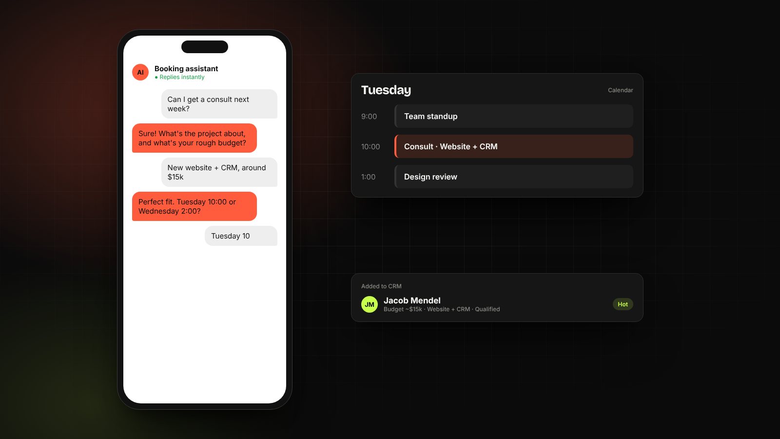
Ask only for what you need to respond well. Every extra field costs you enquiries. Where it fits, let people book a time directly instead of waiting for a reply.
7. Real people, real details
Photos of your actual team and work, a clear service area, a physical address if you have one, and straightforward answers about process and pricing ranges. Specifics build trust; stock photos and vague promises erode it.
8. Connected to everything behind it
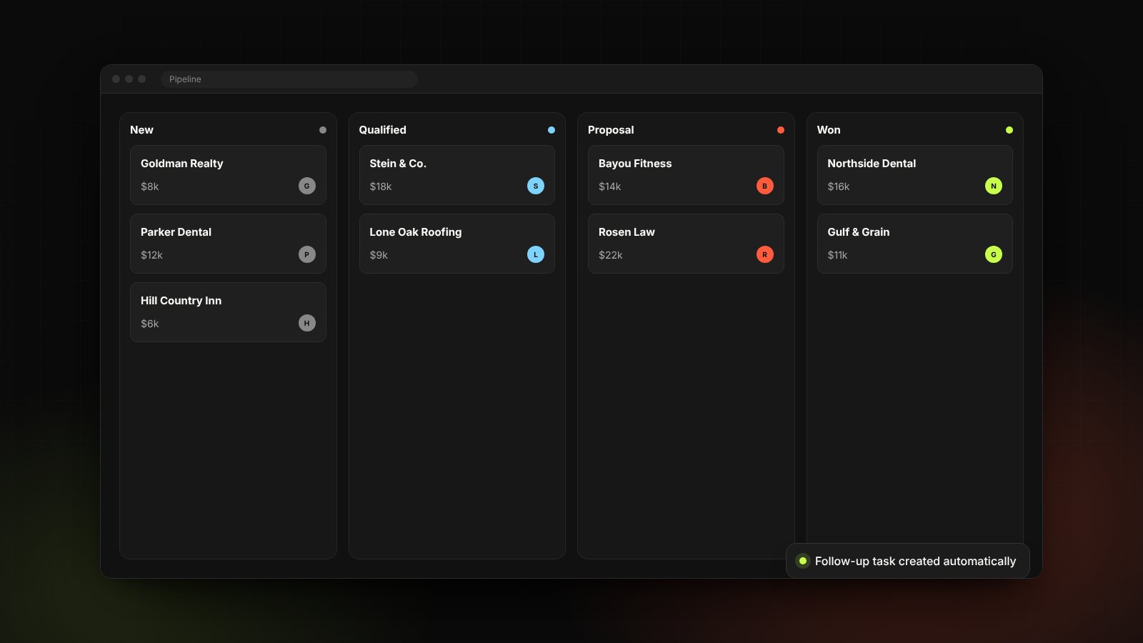
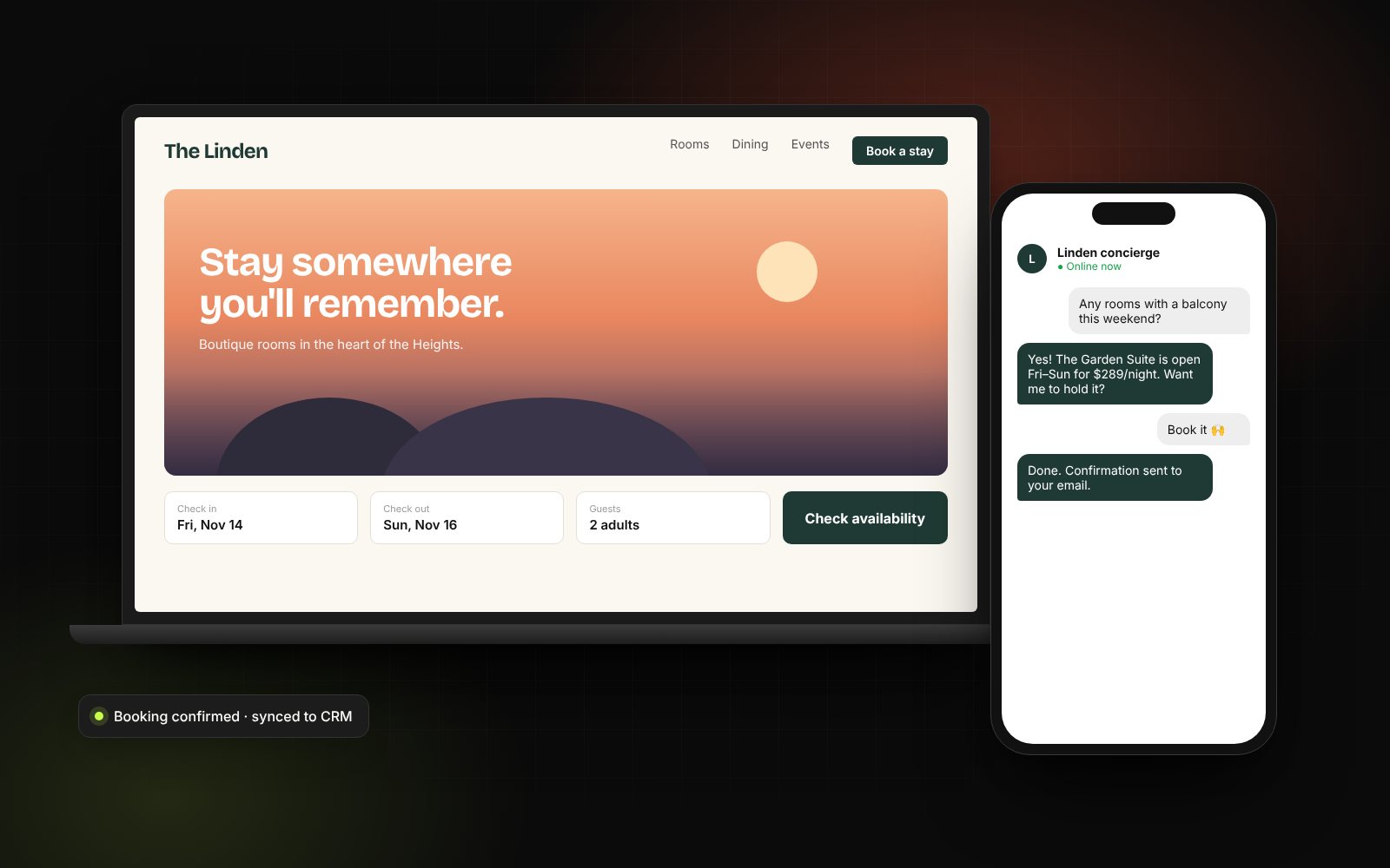
Every form submission should land in your CRM automatically, with the page and source it came from. Every key action, from calls and form submissions to bookings, should be tracked in analytics so you know what's working.
9. Easy for your team to update
Websites decay when every small change requires a developer. Your team should be able to update text, swap photos, add a service page or publish an article themselves.
Common mistakes we see
- Clever headlines that don't say what the business does.
- Five different calls to action competing for attention.
- Reviews buried on a separate testimonials page nobody visits.
- Contact forms that email a shared inbox nobody watches.
- No way to tell which pages or campaigns actually produce leads.
The bottom line
A high-converting website isn't about flashy design. It's about clarity, trust and removing friction, then connecting the site to the systems that turn enquiries into customers.
Wondering how your site stacks up? Our free growth audit reviews it against this checklist, or see how we approach web design.